So far in this chapter, we have communicated with JavaScript using ports and flags. There is one other way: Web Components.
- Web Components
- Web Components are a set of APIs provided by the Web Platform for building reusable custom elements which contain all the necessary HTML, CSS, and JavaScript code. These custom elements can be used inside any framework — including Elm — that works with HTML and JavaScript. You can browse various custom elements on webcomponents.org.
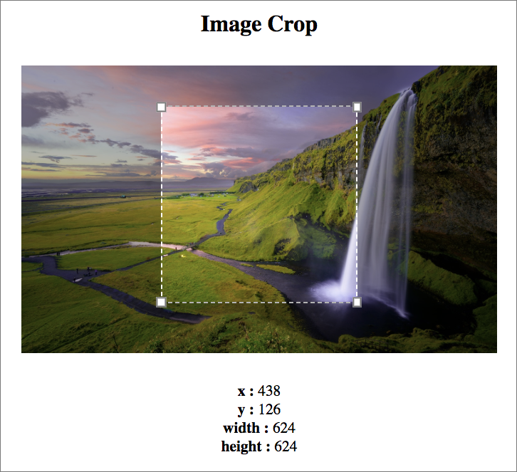
In this section, we’ll learn how to interact with custom elements from Elm by building an app that allows us to crop images. Here’s how the final app will look:
Installing Custom Elements
We can install custom elements from webcomponents.org by using npm. Before we do that though, we need to create a file called package.json in the beginning-elm directory.
In the Building a Simple Page with Elm section from chapter 2, we learned that the elm.json file is used to keep track of which Elm packages our project depends on. Similarly, package.json keeps track of all npm packages used in our project. We can create package.json by running the following command from beginning-elm directory in terminal.
$ npm init -yNote: The -y or --yes flag creates and initializes a package.json file using information extracted from the current directory.
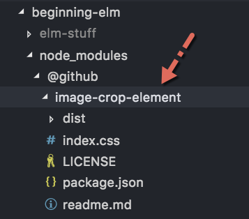
Now run the following command from beginning-elm directory in terminal to install the image-crop-element custom element.
$ npm install @github/image-crop-elementOnce the installation is complete, open package.json from the beginning-elm directory and you should see image-crop-element listed under dependencies.
{
    .
    .
    "dependencies": {
        "@github/image-crop-element": "^2.0.0"
    }
}
You should also see a new directory called node_modules inside beginning-elm. That directory contains all the code necessary for the image-crop-element custom element to work.
Installing NPM Packages Locally
This is the first time we ran the npm install command without the -g option. In earlier chapters, we installed various tools such as elm-format and elm-test using the -g option like this:
$ npm install elm-format -g
$ npm install elm-test -g
The -g option installs packages globally so that we can use them from anywhere in the terminal. image-crop-element is meant to be used only inside our project. That’s why we didn’t use -g. When a package is installed without the -g option, npm assumes that it’s a local package and automatically adds it as a dependency to the package.json file. If you want to be explicit, you can use the --save option like this:
$ npm install @github/image-crop-element --saveImporting Custom Elements
We can load custom elements in our app by using the <link> tag from the beginning-elm/index.html file. Replace the contents of that file with the following.
<!DOCTYPE html>
<html>
  <head>
    <script
      type="module"
      src="node_modules/@github/image-crop-element/dist/index.esm.js">
    </script>

    <link
      href="node_modules/@github/image-crop-element/index.css"
      rel="stylesheet">

    <style>
      .wrapper {
        width: 500px;
        margin: 30px auto;
      }

      .center {
        text-align: center;
      }
    </style>
  </head>

  <body>
    <div id="elm-app-is-loaded-here"></div>
    <script src="elm.js"></script>

    <script>
      var app = Elm.CustomElements.init({
        node: document.getElementById("elm-app-is-loaded-here")
      });
    </script>
  </body>
</html>
The first line inside <head> loads the JavaScript code necessary for running the image-crop-element custom element.
<script
  type="module"
  src="node_modules/@github/image-crop-element/dist/index.esm.js">
</script>
After that we need to load the CSS styles for image-crop-element.
<link
  href="node_modules/@github/image-crop-element/index.css"
  rel="stylesheet">
We also need to define a couple of CSS classes that will be used later to make our UI look better.
<style>
  .wrapper {
    width: 500px;
    margin: 30px auto;
  }

  .center {
    text-align: center;
  }
</style>
Defining Model
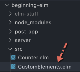
Now that the custom element has been loaded, we’re ready to write the Elm code for interacting with that element. Create a new file called CustomElements.elm in the beginning-elm/src directory and add the code below to it.
module CustomElements exposing (CropData)

import Browser
import Html exposing (Attribute, Html, div, h2, strong, text)
import Html.Attributes exposing (class, src)
import Html.Events exposing (on)
import Json.Decode as Decode exposing (Decoder, int)
import Json.Decode.Pipeline exposing (requiredAt)


type alias CropData =
    { x : Int
    , y : Int
    , width : Int
    , height : Int
    }
We imported a bunch of modules needed by our app. We then defined a model which specifies the width and height of the crop area along with where it starts.
Defining Custom Element Nodes
What’s great about custom elements is that someone else writes the necessary code and all we have to do to take advantage of their hard work is include the tag, such as image-crop, in our app. Just like that our app acquires all the super powers possessed by those custom elements.
In Elm, a tag is nothing but a simple wrapper to the Elm.Kernel.VirtualDom.node function. If you peruse the Html module’s source code, you’ll notice that all of the functions we have used so far from that module do nothing more than apply the node function. For example, here is what the button and input functions’ implementations look like:
button : List (Attribute msg) -> List (Html msg) -> Html msg
button =
    Elm.Kernel.VirtualDom.node "button"


input : List (Attribute msg) -> List (Html msg) -> Html msg
input =
    Elm.Kernel.VirtualDom.node "input"
To use custom elements inside an Elm app we need to convert them to virtual DOM nodes, but we aren’t allowed to use the Elm.Kernel.VirtualDom.node function directly for reasons mentioned in the Elm Kernel section. We need to use the Html.node function instead. Add the following code to the bottom of CustomElements.elm.
imageCrop : List (Attribute a) -> List (Html a) -> Html a
imageCrop =
    Html.node "image-crop"
Defining View
Let’s create our app’s view by using the imageCrop node we just defined. Add the following code to the bottom of CustomElements.elm.
view : CropData -> Html Msg
view cropData =
    div [ class "center" ]
        [ h2 [] [ text "Image Crop" ]
        , imageCrop
            [ src "/assets/images/waterfall.jpg"
            , class "wrapper"
            ]
            []
        ]
The view function displays a header, an image, and a crop area. The imageCrop node represents both the original image that needs to be cropped and the crop area. Just like the Html.img tag, imageCrop uses the src attribute to load the original image.
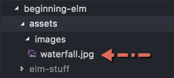
Create a new directory called assets inside beginning-elm and create another directory called images inside assets. After that download the waterfall.jpg image from this repo and put it inside images.
Creating the Asset Module
It’s not a good practice to directly expose the location of an image as we did in the view function above. A better approach is to hide the location inside a module called Asset. Let’s create that module inside the beginning-elm/src directory and add the code below to it.
module Asset exposing (Image, src, waterfall)

import Html exposing (Attribute)
import Html.Attributes as Attr


type Image
    = Image String


-- IMAGES


waterfall : Image
waterfall =
    image "waterfall.jpg"


image : String -> Image
image filename =
    Image ("/assets/images/" ++ filename)


-- USING IMAGES


src : Image -> Attribute msg
src (Image url) =
    Attr.src url
Next, we need to replace the image location in CustomElements.elm with Asset.waterfall.
view : CropData -> Html Msg
view cropData =
        .
        .
        , imageCrop
            [ Asset.src Asset.waterfall
            , class "wrapper"
            ]
            []
        ]
We also need to import the Asset module in CustomElements.elm.
module CustomElements exposing (CropData)

import Asset
.
.
Update
There are no messages flowing through our app yet, so the update function will look very simple. Add the following code to the bottom of CustomElements.elm.
type Msg
    = NoOp


update : Msg -> CropData -> ( CropData, Cmd Msg )
update msg cropData =
    case msg of
        NoOp ->
            ( cropData, Cmd.none )
NoOp means “no operation.” It’s just a placeholder message for now. We’ll replace it with a real one later.
Initial Model
Next, we need to create an initial model. Add the following code to the bottom of CustomElements.elm.
initialModel : CropData
initialModel =
    { x = 297
    , y = 0
    , width = 906
    , height = 906
    }


init : () -> ( CropData, Cmd Msg )
init flags =
    ( initialModel, Cmd.none )
Wiring Everything Up
We’re ready to wire everything up by adding main to the bottom of CustomElements.elm.
main : Program () CropData Msg
main =
    Browser.element
        { init = init
        , view = view
        , update = update
        , subscriptions = \_ -> Sub.none
        }
With that, we’re ready to test. Run elm-live from the beginning-elm directory in terminal using the following command.
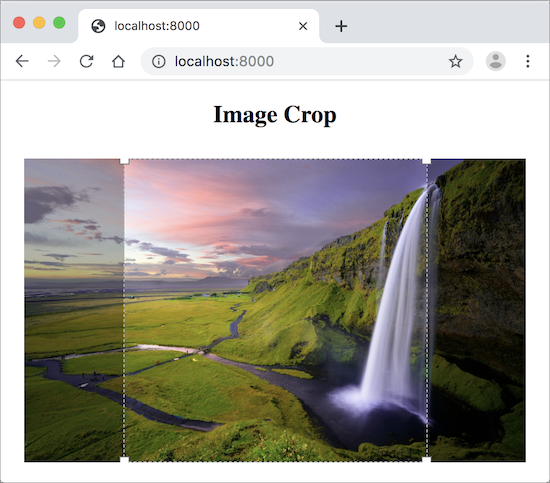
$ elm-live src/CustomElements.elm -- --output=elm.jsGo to http://localhost:8000 in a browser and you should see the following view.
Handling Events Generated by Custom Elements
We can ask a custom element to notify us when something interesting happens by handling one of the published events. For example image-crop-element generates an event called image-crop-change whenever the crop area is moved. Let’s handle that event to understand how an Elm app receives event notifications from a custom element.
image-crop-change is a custom event, so the Html.Events module doesn’t know anything about it. In the previous chapters, we used functions such as onClick and onInput — defined in Html.Events — to handle events generated by the button and input elements respectively.
Although Html.Events doesn’t know about image-crop-change, it lets us handle that event through the use of on function which has the following type.

Add the following code above the view function in CustomElements.elm.
onImageCropChange : Attribute Msg
onImageCropChange =
    cropDataDecoder
        |> Decode.map UpdateCropData
        |> on "image-crop-change"
onImageCropChange uses the on function to create a custom event handler. The first argument is the name of the event: image-crop-change. The second argument is a JSON decoder. Whenever the crop area is dragged around, image-crop-element sends an event object to the Elm app. The structure of the event object looks something like this:
{
    .
    .
    "detail" : {
        "x" : 297,
        "y" : 0,
        "width" : 906,
        "height" : 906
    }
}
The code for decoding crop data out of the event object is quite simple. Add the following code below onImageCropChange in CustomElements.elm.
cropDataDecoder : Decoder CropData
cropDataDecoder =
    Decode.succeed CropData
        |> requiredAt [ "detail", "x" ] int
        |> requiredAt [ "detail", "y" ] int
        |> requiredAt [ "detail", "width" ] int
        |> requiredAt [ "detail", "height" ] int
We used the requiredAt function from the Json.Decode.Pipeline module to pull the crop data out of a nested JSON object. The code in onImageCropChange, however, looks a bit strange.
onImageCropChange : Attribute Msg
onImageCropChange =
    cropDataDecoder
        |> Decode.map UpdateCropData
        |> on "image-crop-change"
Why are we using the Json.Decode.map function instead of passing cropDataDecoder directly to the on function like this:
on "image-crop-change" cropDataDecoderThe answer lies in the on function’s type signature.
on : String -> Decoder msg -> Attribute msgOur decoder returns the CropData type, but the on function expects a decoder that returns a message. We need a function that can convert CropData to a message type. Json.Decode.map is that function. Here’s how its type signature looks:
map : (a -> value) -> Decoder a -> Decoder valueJson.Decode.map translates the CropData type into UpdateCropData which is a message we need to define. Replace NoOp with UpdateCropData in the Msg type.
type Msg
    = UpdateCropData CropData
Now do the same in the update function.
update : Msg -> CropData -> ( CropData, Cmd Msg )
update msg oldCropData =
    case msg of
        UpdateCropData newCropData ->
            ( newCropData, Cmd.none )
Next we need to add the onImageCropChange custom event handler to the imageCrop node in view.
view : CropData -> Html Msg
view cropData =
        .
        .
        , imageCrop
            [ Asset.src Asset.waterfall
            , class "wrapper"
            , onImageCropChange
            ]
            []
        ]
The only thing remaining is to display crop data when the crop area is dragged. Add the following code below the view function in CustomElements.elm.
viewCropData : CropData -> Html Msg
viewCropData cropData =
    div []
        [ viewCropDataLabel "x" cropData.x
        , viewCropDataLabel "y" cropData.y
        , viewCropDataLabel "width" cropData.width
        , viewCropDataLabel "height" cropData.height
        ]


viewCropDataLabel : String -> Int -> Html Msg
viewCropDataLabel name value =
    div []
        [ strong [] [ text (name ++ " : ") ]
        , text (String.fromInt value)
        ]
And render viewCropData below the imageCrop node in view.
view : CropData -> Html Msg
view cropData =
.
.
, imageCrop
[ Asset.src Asset.waterfall
, class "wrapper"
, onImageCropChange
]
[]
, viewCropData cropData
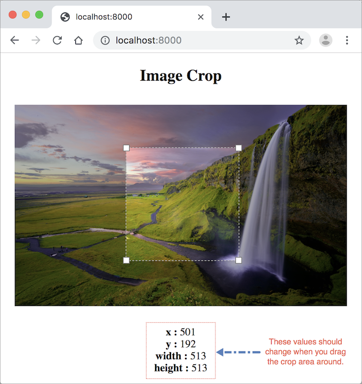
]Check the elm-live window in terminal to make sure there are no errors and go back to the page at http://localhost:8000. The data displayed at the bottom of the page should change when you drag the crop area around.
Summary
In this section, we discovered yet another way of interacting with JavaScript from an Elm app. Custom elements are reusable widgets built using the Web Components specification. They contain the necessary HTML, CSS, and JavaScript code. All we have to do is include the tag in our app. We can also listen to the events generated by a custom element using the Html.Events.on function.
Unfortunately, Elm can’t guarantee that the custom elements won’t cause runtime errors because they are written in JavaScript which doesn’t have a robust type system like Elm’s. So use them only if you don’t have a safer alternative. Here is the entire code from CustomElements.elm for your reference:
module CustomElements exposing (main)

import Asset
import Browser
import Html exposing (Attribute, Html, div, h2, strong, text)
import Html.Attributes exposing (class, src)
import Html.Events exposing (on)
import Json.Decode as Decode exposing (Decoder, int)
import Json.Decode.Pipeline exposing (requiredAt)


type alias CropData =
    { x : Int
    , y : Int
    , width : Int
    , height : Int
    }


imageCrop : List (Attribute a) -> List (Html a) -> Html a
imageCrop =
    Html.node "image-crop"


onImageCropChange : Attribute Msg
onImageCropChange =
    cropDataDecoder
        |> Decode.map UpdateCropData
        |> on "image-crop-change"


cropDataDecoder : Decoder CropData
cropDataDecoder =
    Decode.succeed CropData
        |> requiredAt [ "detail", "x" ] int
        |> requiredAt [ "detail", "y" ] int
        |> requiredAt [ "detail", "width" ] int
        |> requiredAt [ "detail", "height" ] int


view : CropData -> Html Msg
view cropData =
    div [ class "center" ]
        [ h2 [] [ text "Image Crop" ]
        , imageCrop
            [ Asset.src Asset.waterfall
            , class "wrapper"
            , onImageCropChange
            ]
            []
        , viewCropData cropData
        ]


viewCropData : CropData -> Html Msg
viewCropData cropData =
    div []
        [ viewCropDataLabel "x" cropData.x
        , viewCropDataLabel "y" cropData.y
        , viewCropDataLabel "width" cropData.width
        , viewCropDataLabel "height" cropData.height
        ]


viewCropDataLabel : String -> Int -> Html Msg
viewCropDataLabel name value =
    div []
        [ strong [] [ text (name ++ " : ") ]
        , text (String.fromInt value)
        ]


type Msg
    = UpdateCropData CropData


update : Msg -> CropData -> ( CropData, Cmd Msg )
update msg oldCropData =
    case msg of
        UpdateCropData newCropData ->
            ( newCropData, Cmd.none )


initialModel : CropData
initialModel =
    { x = 297
    , y = 0
    , width = 906
    , height = 906
    }


init : () -> ( CropData, Cmd Msg )
init flags =
    ( initialModel, Cmd.none )


main : Program () CropData Msg
main =
    Browser.element
        { init = init
        , view = view
        , update = update
        , subscriptions = \_ -> Sub.none
        }